The
Fiction and Literature Section of a Major Bookstore
Gerome Miklau
CSE 510 / Spring 2001 / Lab #1

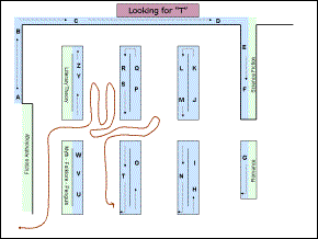
Above is a map of the Fiction and Literature section of a Barnes & Noble bookstore. It is the largest single-subject area of the bookstore, arranged alphabetically by author. A diverse collection of authors is included here, ranging from Tom Clancy and Stephen King to Charles Dickens and Plato. The following analysis focuses on customers attempting to locate a book by a given author. Although this is not the only way to “use” the Fiction and Literature section, it is at least a very common use.
In the map above, the BLUE areas denote the A-Z arrangement of the Fiction and Literature section while the GREEN denotes other parts of the collection.
Design Flaws
- There are no signs or maps of any kind indicating which authors are displayed, or how the alphabetical series is arranged. A customer must check the spines of the books on the nearest shelf to orient themselves in the alphabetic series.
- Most customers, coming to the second floor by the escalators, arrive in the Fiction and Literature section from the left, and find themselves lost between Fiction Anthology and a mixture of Penguin classics, and Folklore. The beginning of the alphabetical series is tucked behind a small corner, an unlikely place for anyone to begin their search. (Although many customers may not be looking for the beginning of the alphabet, it would be the most comforting place to find yourself at the beginning of a search.)
- The alphabetical series of books is situated so that A and Z are within feet of one another, although thankfully they are not directly adjacent or opposite.
- The alphabetical series consists of two major elements: A to G which wrap around the perimeter of the section, and H to Z which straddle islands in the middle of the section. Within each section, the arrangement of books is consistent, once it is understood. But imagine finding yourself at location (1) where to the left you find Z, to right S, and in front of you, C. It seems impossible to decipher the logic of the arrangement from this information, in part because you are witnessing the two different elements at once.
- The only signs available to help are numbers indexing the islands occupying the central area, as shown above. Inexplicably, the first in the series is 51. Perhaps the numbers provide a clue to the path of the alphabetic ordering. The earliest number coincides with F. There is no number on the island containing G. The numerical order increases with letters for H, I, J, and K, but then when the alphabetic ordering reverses, the number seem inconsistent. (When asked about the numbering scheme, the sales staff reported that the numbers were referenced by a map that no longer exists, and that they now have no significance to the Fiction and Literature section.)
Observations
In order to assess customers’ experiences of searching for a book, the same map is reproduced below with trails of the paths followed by actual customers through the area. The beginning of a trail marks a customer’s entrance into the area, and the trail ends with the first place where the customer picked up a book and paused. I selected customers to track by waiting for those who approached the area with a sense of purpose, as opposed to those who were aimlessly browsing.


Analysis of design motivation
The reasons behind this confusing, almost cruel, design could be incompetence or simply laziness. It is conceivable, though unlikely, that as new books are published the boundaries between alphabetic regions change, and that it would be difficult to maintain a coherent map or system of labels.
Instead, I am convinced the design is intentionally disorienting. The design makes it nearly impossible for a customer, having a single book in mind, to find the book and leave without having to explore a large part of the area. While doing so, the customers are forced to look at the spines of the books themselves. It is a devilish way to force customers to browse.
In contrast to this design, the University Bookstore has letters of the alphabet prominently displayed above each three-foot shelf section in their Literature area. To the credit of Barnes & Noble, there was no lack of service staff available during my observations.
Possible design improvements
Large letters labeling the shelves would solve almost all the difficulties in locating a book. It would be best to arrange the labeling so that the customer approaching the Fiction and Literature area could conceptualize the arrangement of books easily before entering the area. Once in the area, there are usually obstacles to visibility since bookstores tend to display books on shelves that are higher than the average human height. This makes it difficult to see signs that are displayed and to get a sense of the global arrangement of the area. One possible solution is to annotate the ceiling which is always visible. An external map is also a possibility. While some of these measures may be extreme for the Fiction and Literature section of Barnes & Noble, the same problems exist in large video stores, libraries, etc.